10 Website Mistakes That Cost Real Estate Businesses Leads
A real estate website rarely fails because it looks bad. It fails because visitors cannot quickly see what to do next, or because the inquiries it does produce are not handled well. The good news is that most of these problems are easy to spot and fix. Here are ten we see again and again across brokerages, agents, property managers, and developers.
1. No clear next step on key pages
Many pages describe the business but never ask the visitor to do anything specific. Every important page should have one primary action that matches the visitor: request a home valuation, book a property management consultation, schedule a viewing, or submit a deal.
2. The same message for every audience
Sellers, buyers, landlords, tenants, and investors have different questions. A homepage that tries to speak to everyone at once usually speaks to no one. Give each audience a clear path and a page written for them.
3. Slow pages on mobile
Property searches and quick research often happen on phones. Large images, heavy scripts, and too many plugins make pages slow, and slow pages lose visitors before they read anything. Compress images, remove what you do not need, and test on a real phone.
4. Long, intimidating forms
Asking for everything up front feels like work. Start with the few details you need to respond well, and collect the rest in the conversation or a follow-up step.
5. Inquiries that go into an inbox
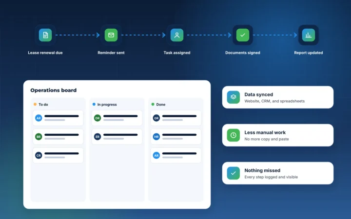
If a form only sends an email, nobody owns the lead and nobody tracks it. Connect forms to a CRM, assign each inquiry to a person, and send an immediate confirmation so the prospect knows what happens next.
6. No proof of local expertise
Visitors want to know you understand their area and property type. Neighborhood pages, local market notes, and clear explanations of your process build that confidence. Only share results and reviews that are genuine and verified.
7. Hidden contact options
Some visitors want a form, others want to book a call directly. Make both easy to find, and keep the main call to action visible in the header.
8. Outdated content
Old listings, past events, and former team members signal neglect. Choose a website platform your team can update without a developer, and set a simple monthly review.
9. No tracking from visit to client
Without tracking, you cannot tell which pages or campaigns produce real business. Set up analytics and connect it to your CRM so you can see which sources lead to appointments, not just visits.
10. Treating launch as the finish line
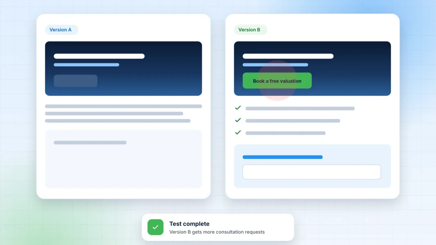
A website improves with use. Review where visitors drop off, test clearer headlines and offers, and keep refining. Small, regular improvements often outperform a redesign every few years.
Where to start
If you only fix three things this month, start with a clear next step on your key pages, a short form connected to your CRM, and an immediate reply to every inquiry. Those changes help every other channel you invest in.
Want a second opinion on your website? Book a free strategy call and we will walk through what we would change first.