A design can look perfect in Figma, but turning it into a fully functional WordPress website requires more than copying colors, fonts, and layouts. The final website needs to match the original design, work across different screen sizes, load efficiently, and remain easy for the client to manage.
A well planned Figma to WordPress workflow makes this process more predictable. It helps designers and developers identify potential problems before development begins, reduce unnecessary revisions, and maintain consistency between the approved design and the finished website.
Whether you are building a business website, a healthcare website, a landing page, or an ecommerce store, the process follows a similar path: review the design, prepare the assets, choose the right development approach, build the pages, and test everything before launch.
This guide explains each stage of the Figma to WordPress workflow, including practical considerations for developers working with WordPress and Elementor.
Review the Figma Design Before Development
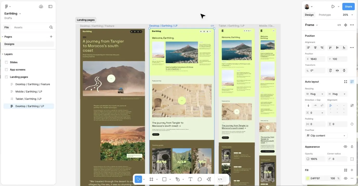
The first step in a successful Figma to WordPress project is understanding the design before writing code or opening Elementor.
Start by reviewing the complete Figma file. Identify all the pages, reusable sections, navigation elements, interactive components, and responsive layouts. Do not assume that the homepage represents the entire project.
For example, a business website may include a homepage, about page, services page, individual service templates, blog archive, blog detail page, and contact page. Each page may use shared components, but the content structure and layout can differ.
During the review, check:
Page structure: Identify all pages and their major sections.
Typography: Record font families, font weights, sizes, and line heights.
Colors: Identify brand colors, backgrounds, borders, and text colors.
Spacing: Review section padding, content gaps, margins, and alignment.
Assets: Locate logos, icons, illustrations, images, and other visual resources.
Interactions: Identify dropdowns, tabs, sliders, accordions, popups, and other interactive elements.
Responsive layouts: Check whether desktop, tablet, and mobile designs are provided.
If anything is unclear, ask the designer or client before development begins. Clarifying missing details early is usually easier than rebuilding a section later.
Prepare Images, Icons, and Other Assets
Once you understand the design, prepare the assets you will use during development.
A common mistake in a Figma to WordPress project is using screenshots of design elements instead of exporting the actual assets. This can make the website harder to maintain and may reduce image quality on different screens.
Export logos, icons, illustrations, and photographs in appropriate formats. Use SVG for suitable vector graphics, WebP for many photographic images, and PNG when transparency is needed and SVG is not appropriate.
Before uploading images to WordPress, check their dimensions and file sizes. A large hero image may look excellent in Figma, but uploading an unnecessarily large file can slow down the live website.
Create a simple asset checklist:
Logo variations for light and dark backgrounds
Hero images and section photographs
Icons and illustrations
Custom fonts and font weights
Background textures or graphics
Mobile specific images, if the design requires them
Also, confirm that you have permission to use the supplied fonts, images, and other resources on the live website.
Choose the Right WordPress Development Approach
Not every Figma design needs to be developed in the same way. The right approach depends on the design’s complexity, the client’s editing needs, the project budget, and your development skills.
WordPress with Elementor
A practical choice for business websites, landing pages, service pages, and many custom layouts. You can build pages visually, set global styles, and let clients manage content through the WordPress dashboard.
WordPress Block Editor
Useful for content focused websites that need reusable blocks and a more native WordPress editing experience. Block themes can also support site wide editing through the Site Editor.
Custom Theme Development
Suitable for projects requiring specialized templates, custom functionality, or deeper control over the code. This approach can offer flexibility but generally requires more development and testing.
For many small and medium sized business websites, Elementor offers a useful balance between design control and client editing. However, a complex web application or a highly specialized website may require custom development.
The goal is not to choose the most complicated approach. It is to choose the approach that can reproduce the design reliably while keeping the finished website maintainable.
Set Up WordPress Before Building Pages
Do not start by recreating the homepage immediately. Prepare the WordPress environment first.
Install WordPress on a local development environment or staging site so you can build and test without affecting an existing live website.
Then configure the essentials:
Install a suitable theme or establish your custom theme.
Install Elementor and Elementor Pro if the project requires them.
Configure the site title, logo, favicon, and permalink structure.
Set up the necessary plugins and integrations.
Create the required pages and navigation menus.
Configure global typography, colors, and layout settings.
Use a staging environment for existing websites whenever possible. It allows you to test changes before publishing them to the live site.
Keep plugins limited to actual project requirements. Installing unnecessary tools can introduce additional maintenance, compatibility, and performance concerns.
Create Global Styles Before Building Individual Sections
One of the most effective ways to improve the Figma to WordPress workflow is to establish the design system before building every page.
In Figma, designers often define reusable colors, typography styles, spacing rules, and components. Recreate these consistently in WordPress rather than manually styling each element.
For example, configure:
Global colors: Primary brand color, secondary color, body text, headings, backgrounds, and borders.
Typography: Heading styles, body text, buttons, navigation, and supporting text.
Layout: Content width, common gaps, section spacing, and container behavior.
Buttons: Primary and secondary button styles, including hover states and border radius.
Reusable elements: Cards, badges, form fields, and other repeated components.
Elementor’s global settings can help keep these styles consistent across pages. When a brand color or typography setting changes, a global style can reduce the need to edit every element separately.
Pay attention to spacing, too. A consistent spacing system is easier to maintain than dozens of unrelated margin and padding values.
Build the Website in the Right Order
After preparing the environment and global styles, start building the actual pages.
A useful sequence is to build shared elements first, followed by the homepage, remaining page templates, and any specialized functionality.
Start with the header and footer
The header and footer usually appear across multiple pages, so they should be established early.
Recreate the logo placement, navigation, buttons, background, spacing, and responsive menu behavior. Then build the footer with the correct columns, links, contact details, and social icons.
If you are using Elementor Pro, its Theme Builder can help you create reusable headers, footers, and other templates.
Build the homepage
The homepage often contains the most important design patterns, such as hero sections, service cards, testimonials, statistics, and calls to action.
Build these sections in the order shown in Figma. Compare the result with the reference after each major section rather than waiting until the entire page is finished.
Create reusable sections
If the same service card, testimonial layout, or call to action appears on multiple pages, create a reusable component or template where appropriate.
This improves consistency and makes future changes easier.
Complete the remaining pages
Once the shared elements and main design patterns are working, use them to build the other pages.
For a larger website, identify which layouts are unique and which can use the same template with different content. This prevents unnecessary duplication and makes the development process more efficient.
Match the Figma Design Without Making the Layout Rigid
Visual accuracy matters, but copying every desktop measurement as a fixed value can cause problems on smaller screens.
A design that uses a 1200 pixel content area on desktop does not necessarily need a fixed 1200 pixel width on every device. Instead, use a suitable maximum width and allow the layout to adapt to the available space.
For example, a service card layout may display three cards in a row on desktop, two on tablet, and one on mobile.
In Elementor, containers, flexible widths, gaps, and responsive controls can help achieve this without relying on excessive custom CSS.
During implementation, compare the Figma reference and the live page at similar viewport widths. Check:
Container widths and alignment
Heading sizes and line breaks
Image dimensions and cropping
Spacing between sections
Button sizes and placement
Border radius and shadows
Responsive navigation and card layouts
Small differences can accumulate. A heading that wraps onto an extra line may change the height of a hero section, pushing the next element farther down the page.
Make adjustments systematically instead of adding arbitrary spacing to compensate for an underlying layout issue.
Make the Website Responsive
Responsive behavior should be part of the build process, not a final task after desktop development is complete.
Figma may include separate desktop, tablet, and mobile frames. Use those references to understand which elements should resize, stack, move, disappear, or change their presentation.
For example, a desktop navigation bar might become a mobile menu. A two column section may stack vertically, while a large heading may need a smaller font size and different line height.
Check more than the default desktop, tablet, and mobile presets. Test intermediate widths as well, because some layouts break between the standard device sizes.
Elementor provides responsive editing controls and supports custom breakpoints for layouts that need more detailed adjustments.
Avoid hiding important content on mobile simply because it is difficult to fit. Instead, rethink the layout, spacing, and order of elements so the information remains useful and accessible.
Add Functionality and Dynamic Content
A Figma design shows how a website should look, but it does not always explain how every component should behave.
During development, identify the functionality required for the finished website.
For a business website, that may include contact forms, dropdown menus, testimonials, appointment requests, and interactive calls to action.
For a healthcare website, it might include appointment booking, doctor profiles, department pages, and patient inquiry forms.
For an ecommerce website, it could involve product variations, filters, shopping carts, checkout, and customer accounts.
Use native WordPress functionality or appropriate plugins where possible. Custom code may be necessary when the requirements cannot be met reliably with existing tools.
Make sure each interactive element works as intended. A button that looks correct but leads nowhere is not a finished component.
Optimize SEO, Accessibility, and Performance
A successful Figma to WordPress conversion should produce more than a visually accurate website. It should also be usable, accessible, and technically sound.
SEO
Give each page an appropriate title, meta description, URL, and logical heading structure. Add descriptive image alt text where images convey meaningful information, and ensure that navigation links work correctly.
If the project replaces an existing website, plan URL redirects carefully to protect existing links and search visibility.
Accessibility
Use semantic headings, descriptive links, keyboard accessible controls, and sufficient color contrast. Do not rely on color alone to communicate important information.
WordPress accessibility guidance recommends considering accessibility from the beginning rather than treating it as a final correction.
Performance
Optimize images, avoid unnecessary plugins, limit excessive animations, and check whether scripts or external resources are slowing down the site.
Use a performance testing tool to identify the biggest problems rather than assuming that a particular plugin will make the website faster.
WordPress’s theme testing guidance also recommends checking performance, responsive behavior, and compatibility before a site is released.
Test the Website Before Launch
Before publishing the website, compare the finished pages against the approved Figma designs and test the important user journeys.
Use this checklist to catch common issues.
Do not launch simply because the homepage looks correct. Internal pages, forms, mobile navigation, and other functionality can still contain problems that are not visible in a desktop preview.
Final Thoughts
A reliable Figma to WordPress workflow begins with a clear understanding of the design and ends with a website that has been tested in real conditions.
Review the design before development, prepare the assets, establish global styles, build reusable components, and make responsive behavior part of the process. Then check functionality, SEO, accessibility, and performance before launch.
For many business websites, WordPress with Elementor offers an efficient way to translate Figma designs into editable pages. Other projects may benefit from the WordPress Block Editor or custom theme development.
The best approach is the one that preserves the design’s intent while producing a fast, usable, maintainable website that meets the client’s actual needs.
Frequently Asked Questions
What is the Figma to WordPress process?
The Figma to WordPress process involves reviewing a design, preparing assets, setting up WordPress, recreating the layout and styles, adding functionality, making the site responsive, and testing it before launch.
Is Figma to WordPress conversion automatic?
Some tools can assist with generating code or transferring parts of a design, but fully reliable conversion usually requires manual review and development. Responsive behavior, accessibility, functionality, and WordPress integration still need to be checked.
How long does a Figma to WordPress project take?
The timeline depends on the number of pages, design complexity, custom functionality, responsive requirements, and the development approach. A simple landing page may take much less time than a large website with custom templates and integrations.
How can I make a Figma to WordPress website responsive?
Use flexible containers, appropriate widths, responsive typography, and device specific layout adjustments. Compare the website with the Figma references and test at several screen widths rather than relying only on default device presets.